 |
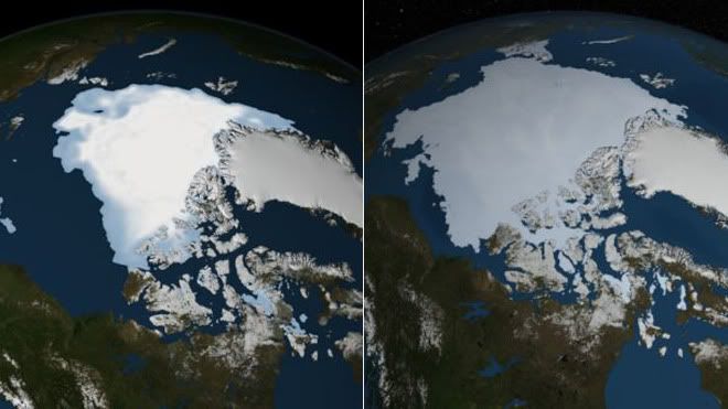
| 2012 Ice Coverage vs 2013 Ice Coverage |
Yup, climate change deniers have jumped on this story to not only claim that this proves that global warming isn't happening, and that the Earth is actually cooling. Yeah, about that...
There are multiple problems with these claims. The first is that they ignore the evidence that shows that the Earth is indeed warming. The next is the false conclusion that more ice coverage this year year means that the Earth is cooling rather than warming. These conclusions are false of course.
Yes, the ice coverage this September is 60% higher than last September. But does that mean that global warming is fake. Nope. Remember, last year showed a record low for Arctic Sea ice coverage. So after a record low, it's not unexpected to see the next year have greater ice coverage.
But there is something more important to remember. Even though there is more ice coverage than last year, the amount of ice there is still below average ice coverage. If this trend were to continue year after year, it could be seen as something to bring climate change into question. But one year is certainly not the silver bullet warming deniers wish it was.
Actually, let me take that back somewhat. Even if this current ice level became stable somehow, it wouldn't disprove global warming if the global average temperature continues to rise. To back up the claim that this proves global cooling, we would need to see a long term trend of the global average temperature dropping... So basically the opposite of what is actually going on.
Think of it as being 10min late for work on Monday, then you are 5min late the next day. According to the 'logic' being used by those eating this story up, you were actually on time Tuesday, because you weren't as late as on Monday. But we all know that's not true. 5min late is still late.
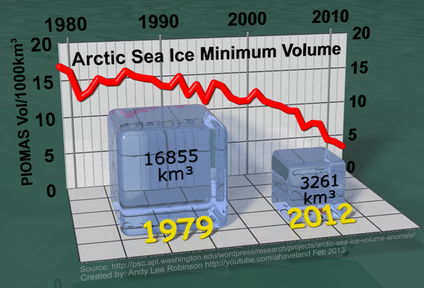
There is an even bigger and more important piece of data missing from these sensationalized stories. That very important figure is ice density. While ice coverage can be easily compared via satellite images, they aren't a very good tool to use when trying to make meaningful predictions. That's because ice coverage doesn't necessarily how much ice there is. So what is the density data telling us? It's telling us that the volume of ice is actually quite a bit down from where it should be. So there is actually LESS ice, but it is just covering a wider area this year.
Some may be wondering how that could be. The answer to that is in the thickness of the ice. This fact is actually visible in the satellite images that so many are claiming as proof against warming. When you look at those images, look at the coloration. See the very white white in the left image above? That's thick ice. See how the ice in the second picture is a dull blue-grey? That's thinner ice. When you add up all the ice volume, your left with less ice covering more surface area.
You could do your own experiment by taking a picture of an ice cube from above. Then sit it in a tray and allow it to melt. Once it's melted, place it in the freezer. Once frozen, look at it from above and compare it to how it looked when it was an ice cube. You will see that the ice that was formed from the thaw and re-freezing of the ice cube looks like it's larger. But it isn't. There is actually the same amount of ice there at most, and likely a little less since some water will have been lost through evaporation.
Finally, the most frightening part is that thinner ice melts faster than thicker ice. Seeing as the ice is spread more thinly this year, I fear a very fast thaw next year. Could we be seeing another record low in the next year or two?
As I hope I have shown, the stories that this ice data disproves climate change shows how quick some can be to twist and distort the data to further their agenda. Time will tell the truth. But how long do we have to wait before we actually decide to get serious on this issue?
-Brain Hulk
Please share, subscribe, comment and follow us on your favorite social networking sites!
facebook | google+ | twitter


No comments:
Post a Comment